Citi Cards New Site Design
Citi’s website has long been mediocre in my opinion. While they did give the site a visual refresh a few years ago, it still doesn’t work well. Sometimes my passwords don’t log me in even though they are correct and other times I end up with damaged cookies forcing me to use incognito mode or refresh my browser. It’s frustrating and unfortunately that won’t change.
What will change though is the usefullness of the Citi website’s interface. Building on top of their design refresh from awhile back, Citi has enhanced a few sections of their website including the main page you see when logging in. Earlier today I was informed of the changes when accessing my account.
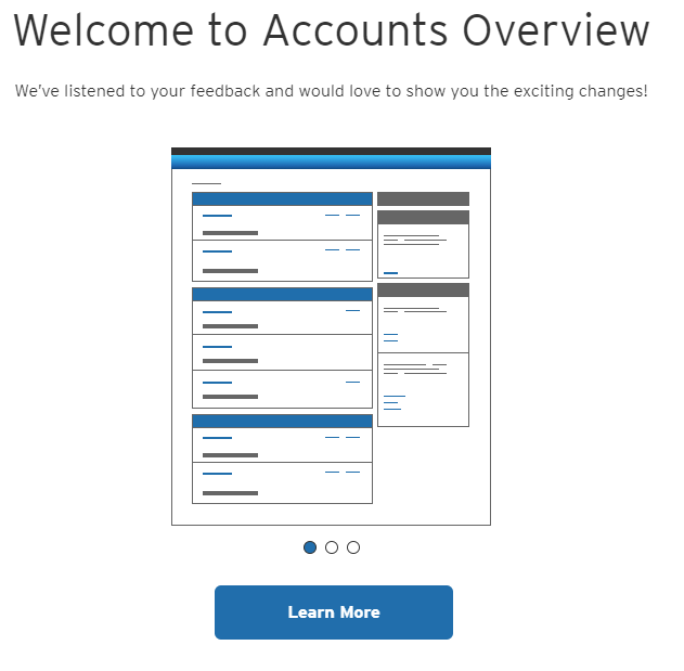
I couldn’t wait to see what was new. Unfortunately this is just a minor refresh and not a major redesign. Here is what they tout as being new.
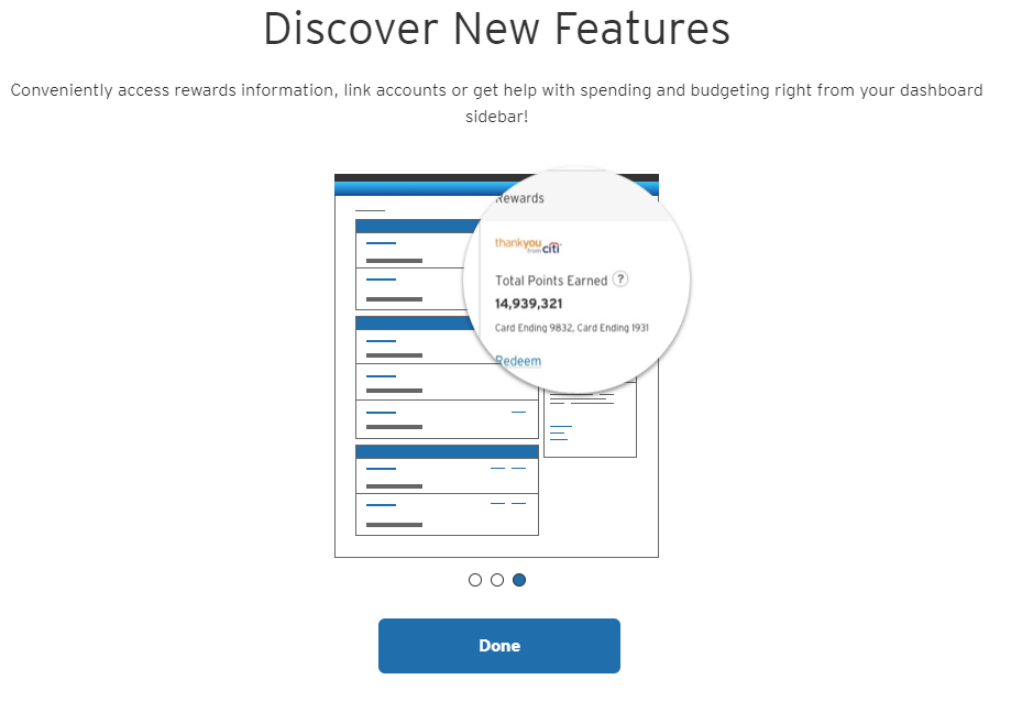
Basically they are making certain information easier to get to. We’ll look at this a bit closer later on. Here is the second major change they are marketing.
Again, this is more of a re-design than adding anything new. That information was on the sidebar before but just looks different. Let’s dive a little deeper into the new Citi cards website design.
Citi Cards Website Design Homepage
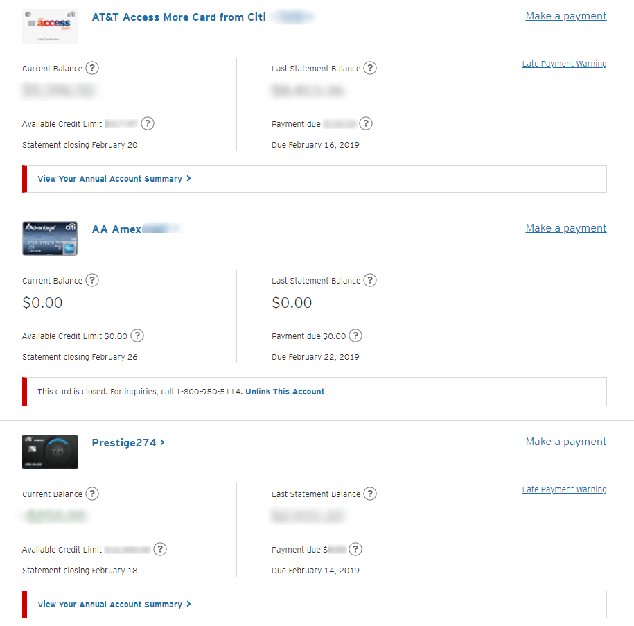
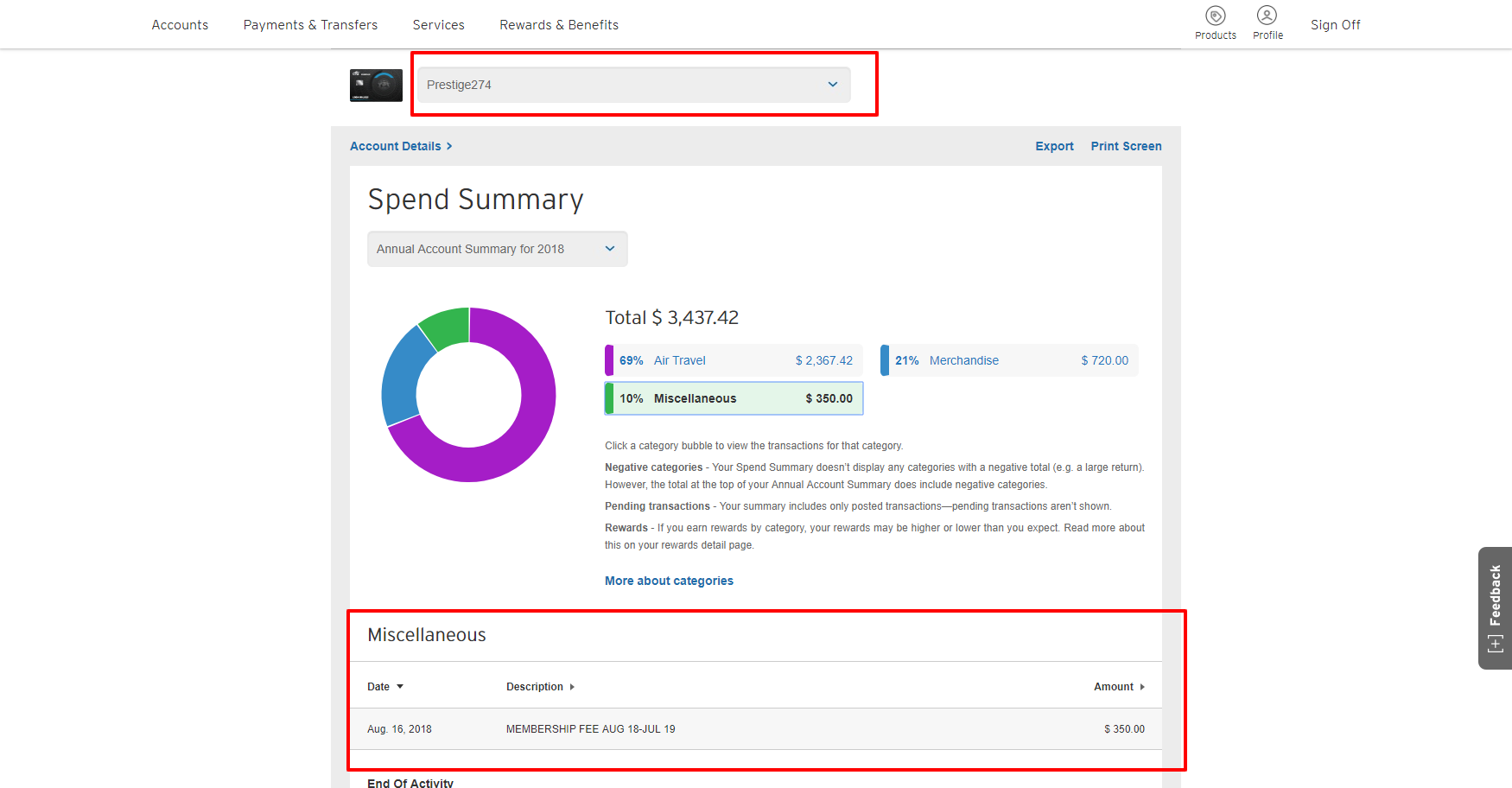
As I mentioned before, most of the changes are on the front page. They have really tightened up the display of information and thus seem to get much more useful stuff in a smaller area. It also seems easier to get an overview of all of your cards at once.
There isn’t anything life changing here, but you can see all of your information in one place. Of note is easy access to your annual account summary. This is a pretty cool way to look at the spending breakdown for your cards.
Citi has made navigating very easy as well. At the top you can stay on this screen but switch cards easily. Note that when you click a category such as in the screenshot above, it displays your charges in that category below. This makes it very easy to see where your money is going. Some of this existed before, but the design seems more streamlined to me.
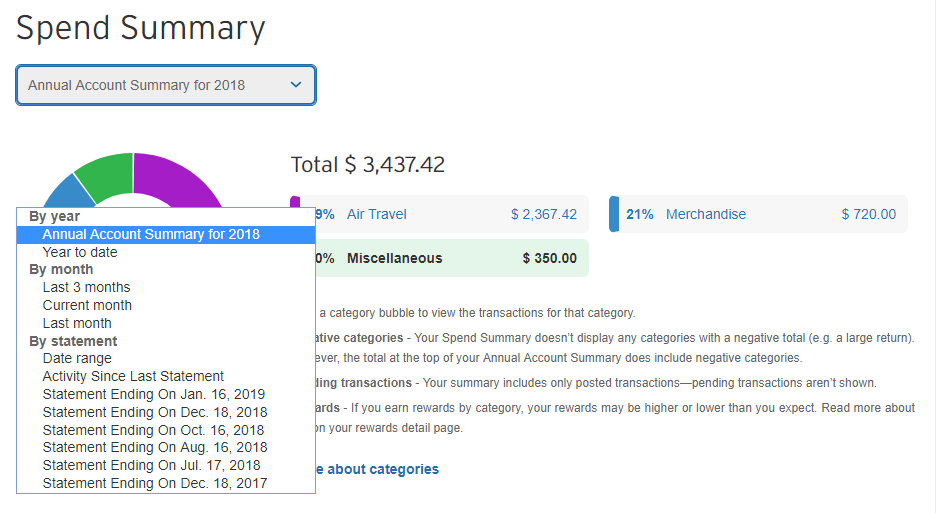
Note that you can also click the “Annual Account Summary” drop down as shown below and quickly view transactions and a breakdown for various time periods. Well done.
Rewards Layout
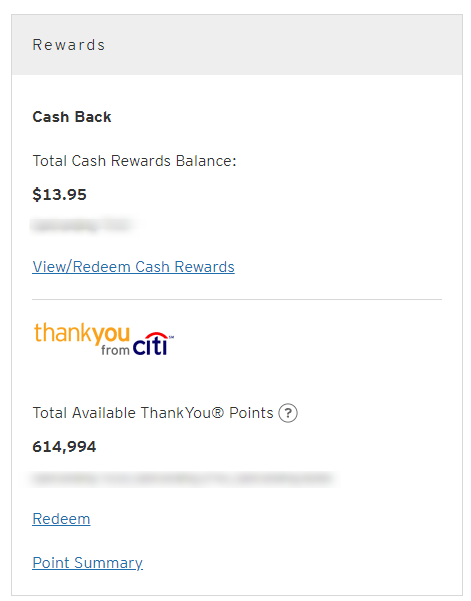
In addition to the account information displayed like above, Citi’s new design displays your rewards in a bit nicer way on the side of the screen as hinted at before. Nothing major, but it does fit in with the overall cleaner design.
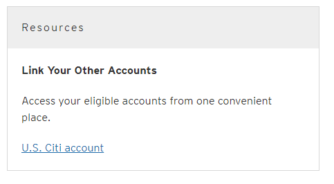
Just below the rewards info, they have also added a link to the main page allowing you to easily link your Citi accounts. I haven’t tried linking personal and business accounts together since this change, but I suspect it still doesn’t work.
Much the Same
For the most part everything else has remained the same as far as I can tell. For example when you go to make a payment or view individual account information, it reverts to the same screen you would have seen before.
Conclusion
While Citi’s website remains far from my favorite in terms of usefulness, I do have to say this new design language is an improvement. With their last redesign they made the site much more modern and this improves on that. Now if they could only improve the code on the backend!
Have you discovered a feature of the new Citi cards website design that I didn’t mention? Please share your thoughts/experiences with this new design in the comments!


