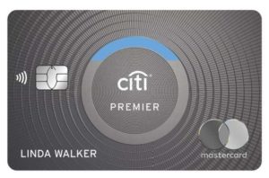
Citi Unveils Sleek Redesign for ThankYou Cards Lineup
Citi announced this week that soon cardmembers will have access to redesigned credit card products. The Citi Rewards card portfolio has unveiled refreshed cart art, which will be available soon.
Starting May 14, the Citi Prestige, Premier, Rewards+ and ThankYou Preferred cards will feature a sleek, modern design which brings the card name into the center of attention while still facilitating contactless payments.
Cardmembers will continue to have access to the same fantastic range of benefits on their current cards and will automatically receive the newly designed card product several weeks before their card expires. If a customer’s card is reissued (due to a new account, card replacement, or any other reason) after May 14, they will also receive the latest design.
There was actually an improvement to one of the cards around the same time the redesign was announced. Citi Premier cardholders can now cash out their points at a value of one cent as Cash Reward or Statement Credit.
You can see the new designs of the four Citi ThankYou credit cards below.
Let us know what you think. Do you like the new designs? Don’t like them? Or just don’t care at all?


The new designs look terrible. Just terrible.
The old designs are so much better. New designs are boring, bleh, and don’t seem premium at all.
I just received by latest Doublecash card. It now has reflective parts in those circle swirls, making it look like a credit card designed by a high school cheerleader. These new designs above have to be an improvement.
The kind of important thing about these designs is that Citi has returned the Mastercard circles to the front of the card after years on the back of the card. However, the words “world” or “world elite” are still on the back of the card, hidden in tiny print. What an idiotic oversight.
They better do a lot more than that. Our Prestige card getting canceled in May due to complete loss of value
New ones are FUGLY & BORING.
The “coin” design on the current thankyou cards is one of my favorites. Also, the best looking citi logo is the silver one with the red accent (see the citi ultima for reference). These have neither of those characteristics and are pretty meh.
How about the offer a new sleek design where your points aren’t watermarked/face expiry/etc? LoL
To quote Mr. Horse, “no sir, I don’t like it.” Earlier this year Ian (https://milestomemories.com/favorite-credit-card-designs/) noted how the Citi logo appears recessed on the Premier card. I see what they’re going for in trying to make it pop out, but I’m on team old design.
+1 I like the current designs more (I hold a Premier and a Prestige) but then I think I like the old school “seal” on the old cards. The new ones just seem bland.