New American Express Website Design
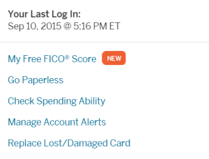
American Express has slowly been rolling out a new website design. I know several people have had the new version of the website for awhile, however my accounts were just updated today. Overall the new website has a cleaner design and easier access to your FICO score, but the way they handle Amex Offers is terrible.

Amex Offers Old vs. New
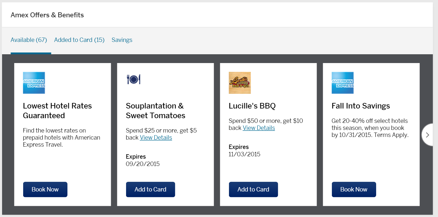
Instead of being able to click a tab where you can see all of your Amex Offers, now they are located in a slider where only four are displayed at a time. In my experience this makes it SIGNIFICANTLY more difficult to see which offers you are targeted for.
Old Design

New Design
The new format of the offers is harder to read as well. While I understand why they would want to use their partner’s logos, I found the old format much easier to understand. Of course, everything takes some getting used to and I think this design would be forgivable if you could see more than 4 offers at a time. When you have as many cards as we have, it can take a long time to search every card for every offer.

One other thing I noticed about Amex Offers is that they now contain more advertisements, especially on the first three screens. For example, in the screenshot above, you can see two ads for American Express Travel. Not that these are terrible, but they definitely seem to be burying the partner offers a bit more. Less offers at a time and more ads is a step backwards in my opinion.
Alternatives?

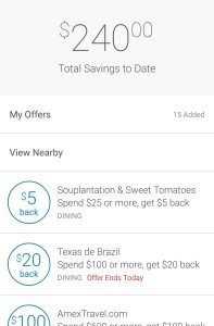
While American Express has made it harder to see all of your offers on the website, they do still allow you to see them on the mobile app. The mobile app also has the benefit of showing you how much you have saved with Amex Offers to date. This will be my go-to method for loading offers from now on.
Conclusion
Like with anything, I will eventually adapt and get used to the new American Express website design. While I think it is a positive change in most ways, it makes targeted offers much harder to find, especially for those people who have a ton of cards.


I’ve had the new website for months and both called and e-mailed American Express when I first got changed over, to let them know that it was very difficult to read the Amex Offers. As you can see, my input had no impact at all (not that I expect it would from one person!). Perhaps if more people tell American Express about their impressions of the new website, it would help to eventually bring about a new design for the Amex Offers. Also, I agree with those people who wrote about getting flooded with non-deals to obscure, high end merchants and about seeing the great targeted offers (Amazon, Home Depot, etc) for which I am not targeted. Frustrating, to say the least!
Yeah, count me as one more opponent of the new design. I’ve had it for several weeks, and it is the epitome of pretty instead of practical. I can only imagine the layers of worthless bureaucracy that this design got approval from. Doesn’t Chenault ever use his own website?
Have we all voice our displeasure directly to AMEX? Enough squeaky wheels…
I’ve had the new website design for months now and STILL dislike the Offers – they are impossible to read. I think this might be an effort to make the site more “mobile-friendly”. They very recently added the partner logos, and I think that may have been an effort to make them more readable. It was really difficult to track/ scan quickly when those little offer tiles were literally almost identical. The old, single-screen way, it took just a second or two to scan the whole list.
I’m generally quite pleased with Amex, but I rarely read through the Offers anymore. It’s just not worth the aggravation.
The problem with the mobile app, I get so paranoid that there may be a lucrative offer on the website, that I go back to the website again. It’s an awful predicamundo.
On this subject, I couldn’t agree more…. I’ve noticed the “new” miserable format in my new Amex accounts since earlier this summer — and have much, much resented it.
Perhaps even more reason for AMEX to wake up and realize the discontent afoot, I’ve been VERY disappointed in all the non-deals to obscure, high end merchants I keep getting flooded with — not that I’ve ever selected ANY of them. Sure there were some great deals earlier this year, but I am sick ‘n tired of seeing promo (here often) for the latest Amex this or that deal — but it doesn’t get “targeted” my way. I hate that.
I thought it was just me. It really irks me when companies redesign a web site to make it prettier only to sacrifice functionality in the process.
As you allude to, consider yourself lucky. I’ve been on the new design for months.
The Amex mobile app is actually better now for Amex offers than the website, because you can scroll through all of them in one go.
http://frequentmiler.boardingarea.com/2015/09/04/bet-you-didnt-know-amex-offers-via-the-amex-mobile-app/
Oh oops sorry missed the part where you talked about the mobile app.
If you think the Amex offers are bad in the new website, wait until you try to book an Amex Fines Hotels & Resorts !!! It’s so bad, I’ve stop booking with them, it is really, really bad !!!
I agree 100% the new website design is terrible.
I used to only have one Amex card but now that I have four it’s so hard to navigate through. I actually missed some offers because of it
Agree. Except I’ll be more harsh. New website is a lot worse (not horrible), and not just the Offers. I also had it pushed upon me today.
Did I mention that I hate change? (Except in the case of Discover!!)