Hyatt Website Redesign
Hyatt has debuted their new website today and with it several new features and a vastly improved design. Let’s take a look at which new features have been added, how the design is much more useful and what is still missing.
Cleaner Look & Info At Your Fingertips
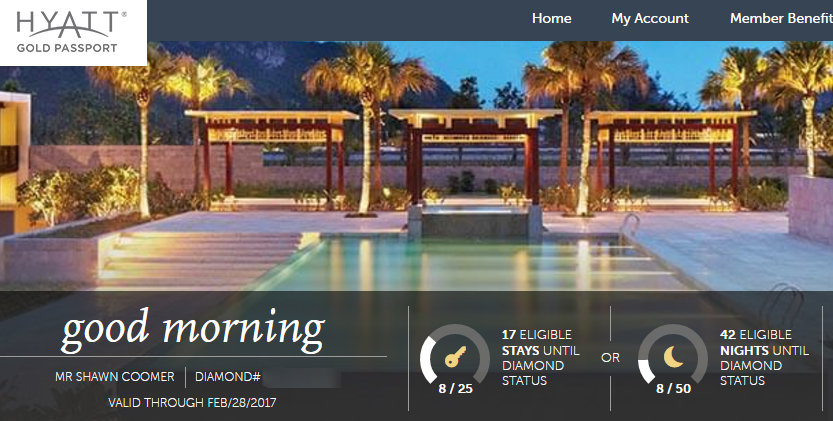
When you login to your account, you will notice that your status tier and progress are displayed in a clean and easy to read way.
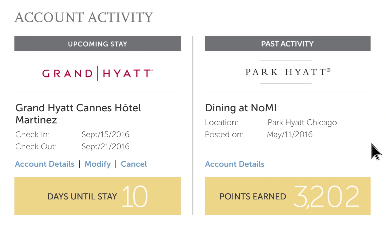
Below this information, you will also find a quick breakdown of recent account activity including your most recent completed stay and your next upcoming stay.
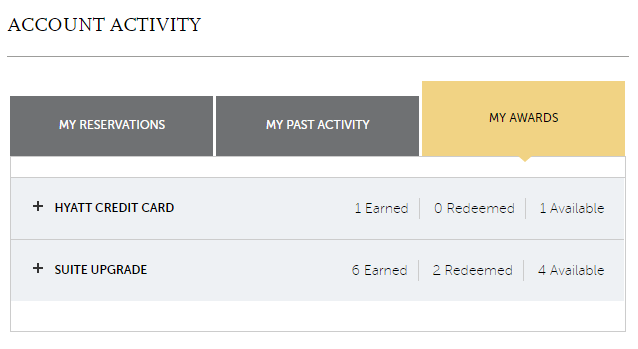
You can also go into the “My Account” section and view all of your recent activity including stays, upcoming reservations and “Awards” such as free night certificates and suite upgrade certificates.
Member Benefits & Redemptions Simplified
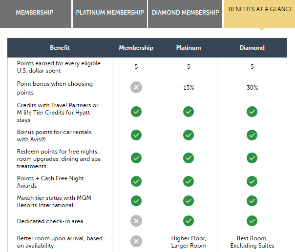
The old website often made it difficult to find all of the information you were looking for. Elite benefits for tiers were shown on separate pages, making it hard to compare. Now they have added a nice new comparison chart showing what you get at each level.
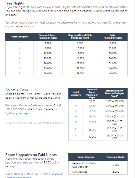
You can also find all of the award charts for normal redemptions, points + cash, upgrades and all-inclusives on one page. That page is a great one to bookmark for reference, although it is easily found under the “Rewards” tab on their site.
New Ways to Search
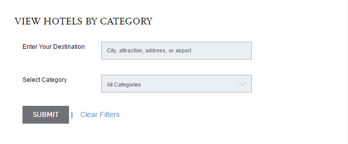
The new website also has new ways to search for hotels. For example, you can now search for hotels by category.
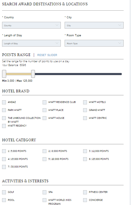
Better yet, if you go to the advanced search, you can search by the number of points you would like to spend, property amenities and even brand.
My Thoughts
Overall this is a vast improvement design wise over the old site. It also seems to run quicker as well which is nice. As someone who spends a lot of time searching and booking Hyatt hotels, this is a very welcome change. With that said, there is one thing that bothers me about the new site when searching for hotels.
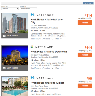
The new search system actually rolled out about a month ago and it no longer allows you to see the award rates for all properties in a search. For example, if you search for hotels in Charlotte, NC then it will show all of the hotels with the paid rate, but the toggle to see award rates is gone. You have to actually go into each property to see the award rate and availability.
Conclusion
The new site is a big improvement and one I am happy to have. Of course nothing is perfect and there is always room to progress even further. Hopefully Hyatt will add the ability to see award availability on the search results screen, but other than that, this is pretty good.
What are your thoughts? What is missing? Let us know in the comments!



It’s the worst downgrade of a site I have ever seen. I spend 100+ nights a year on the road, top things I want to do on the website 1)get my folio for expense purposes and 2) book award hotel stays for my family,
#1 does not work at all, and they’ve just incredibly downgraded the ability to do #2 via removing the ability to quickly see award rates across properties.
It’s bad enough to make me reconsider the incredible effort I go through to keep my points at Hyatt.
I actually agree with your points. The award search is terrible and I can’t seem to access my folio anymore without requesting it and waiting 24 hours. The site is prettier but in those two areas things have regressed.
Can’t retrieve folios for existing reservations anymore, that’s one new bug…
Interesting glitch that it showed how many night before I had lifetime diamond status. Called gold passport and, as I suspected, a glitch.
Having all sorts of problems with the site trying to cancel reservations.
Plus never received any emails.
Finally had to call and cancel over the phone..
Why launch something till they get the bugs out ugggh