A New Fantastic Amex Offers Interface
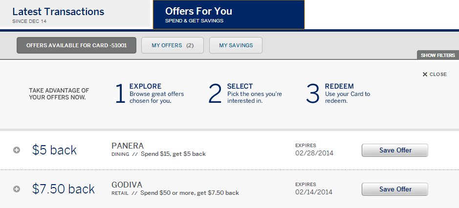
A couple of weeks ago I wrote a post about how to reach the old Amex Offers interface. This was important because American Express had “revamped” prettied their website and made it incredibly difficult to find Amex Offers. Now they have released another new version which is the best of both worlds.

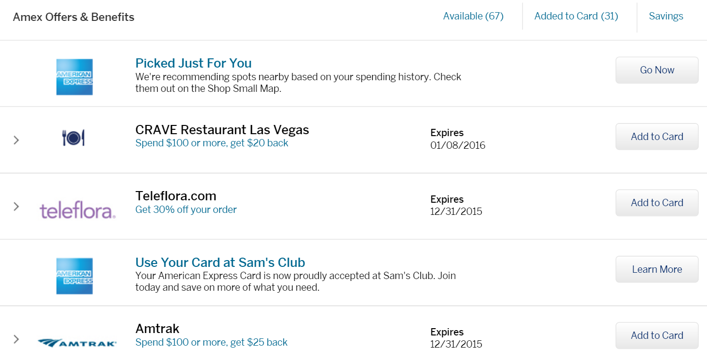
The old Amex Offers version was preferable because you could get a searchable list of all available offers. (Click Ctrl F to search.) The newer version was much prettier with merchant logos, but it only displayed a few offers at a time. Thankfully the new (3rd) version has the best of both.

If you login to your account and go to the offers, you should see a list of seven offers. Click “Load More” and you will get the entire list of available offers. It still has the newer prettier design, but it lists everything in a searchable way similar to before. This is great news since Amex has been releasing a ton of new offers lately!
Conclusion
This is definitely first world problem sort of stuff, but I really hated the previous Amex Offers interface. While the backdoor link I mentioned before still works, I am glad I can now just go to the American Express website and login to see all of my offers in a very easy to digest format. For once a company listened to their customers and American Express should be complimented for that.
HT: Doctor of Credit


[…] holiday season is generally a time where Amex goes crazy with a ton of Amex Offers. (Thank god they fixed the interface just in time!) Many of these offers are only available to targeted cardholders, but a lot are […]
[…] Another New Amex Offers Interface: The Best of Both Worlds! […]