New Chase Ultimate Rewards Website
For a few months Chase has been announcing changes to their various Ultimate Rewards earning products along with a promise that a new website would debut. Well today is the day.
Chase has made a significant upgrade to their Ultimate Rewards website and I am here to show you the changes. While most of the differences are visual, I did find a few differences under the hood.
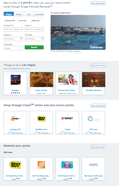
First off you will notice when you login, that the site looks completely different. The old design has been replaced with a more modern flat look that is popular these days. On the homepage the first thing you will see is a snapshot of your account.
The snapshot shows how many points you have right now, how many are coming on your next statement and how your card earns points. (Although you have to click through to see the bonus categories.)

As you scroll down the page, you can book travel through Ultimate Rewards, redeem points for gift cards and access the Shop through Chase portal. It is nice that they have included all of these features right on the page. It is very easy to access everything.
Changes to Points Transfers
As well all know, the best value for Chase Ultimate Rewards is transferring them to travel partners such as United, Singapore Air and Hyatt among others.
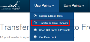
I am sure this option also costs Chase the most money, which is why it isn’t featured on the main page. To transfer points, you have to click “Transfer to travel partners” on the menu under “Use Points”. No big deal.
What is a big deal is what they have changed with the transfer process. The rules have always said you can only transfer points to an account in your name or the name of your spouse/domestic partner. For many years this was never enforced, although last year Chase cracked down on many and shut down their accounts.
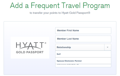
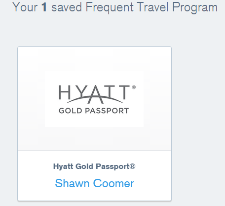
Now when you go to transfer points, you have to register the transfer-to account with the Ultimate Rewards website. During registration the site asks for the member name and number and their relationship. The only two options are “Self” & “Spouse/Domestic Partner”.
Once you “register” this account, it is stored in the system and you can transfer points to it. While this a lot more convenient than before since you don’t have to lookup and type in the account number every time you transfer, this also seemingly makes it easier for them to track your transfer-to accounts.
I personally have never transferred points to anyone but myself or my wife, but I could see this being an issue for some.
Moving Between Accounts
Chase has also made it easier to switch between Ultimate Rewards accounts. Previously you had to click “Switch Accounts” before being brought to another page to do it.
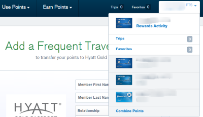
Now to switch accounts linked to the same profile, you simply click the dropdown on the top right of the page. You can also decide to combine points between accounts from the sane place. Simply & easy.
Other New Features
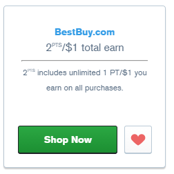
Chase also touts a few other new features. First they will allow you to save your favorite stores/redemption options by clicking the heart. For example if you always like to transfer points for Best Buy gift cards, then that option can be favorited. (Barf!) As is shown in the image above, you can also favorite stores in the Chase portal, which is actually quite useful.
They also appear to be implementing a Trip It like service which stores all of your itineraries in one place. Per their website, “Access all your itinerary details in one place, and find our recommendations for things to do while you’re on the go.”
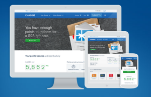
Finally the website is responsive. This means that it should work on computers, desktops and even mobile phones. Nothing too major, but still nice to have
Conclusion
The updates to the Chase Ultimate Rewards website are mostly positive. Having loyalty accounts stored on the site makes things more convenient, but also allows Chase to more easily track and limit how many accounts you transfer too.
Other than that, the design makes some of the less valuable features more accessible which isn’t a surprise, but doesn’t really bother me. I do like the dashboard view when you login and find it useful that they display the number of points coming on the next statement. Good stuff.
Have you found anything on the new site that I missed? What do you think of the design? Let me know in the comments!



[…] Chase Debuts New Ultimate Rewards Website […]
I didn’t have enough experience with the old site to remember exactly how it worked. But I am definitely frustrated by the lack of transaction detail on the new site. For me, the site shows some of my recent activity (transactions through the shopping portal), but not all of it. And I get emails confirming some of my purchases through the portal and not others.
The new site sea to have come with some major changes to the UR shopping portal… Before, you could search for an item, and it would give you a list of stores with the item, with comparisons of the price and earning rates. Now, the system is almost useless for searching for a specific item, instead only showing stores and earning rates. This makes it harder to earn those extra UR points. 🙁
That is a good point. I never used that feature, but I can see how it would have been useful. Try cashbackmonitor to search for the best cash back rate. I know that doesn’t help for specific items, it may help you narrow down the best portal for the stores/type of item you are looking for.
Also Dave,
I do not see any way of trying to look for pending transactions that posts like in the next statement period.
I did an OfficeDepot purchase which has an additional 4X UR points over the last week. From the old site, I could have gone to the UR Portal activity and could have seen the pending purchase and points waiting to be posted at the end of statement closing cycle.
Now they removed that feature and the only way one would know about this bonus points is by looking in to the statement.
Is there any way we can look in to the Bonus shopping points from portal activity which occurred in the current month and in the last statement periods?
Looks like Chase pulled out that feature and I am not sure how I can keep track of pending points from shopping portal purchases.
This creates a major disadvantage to business owners with Ink cards wishing to redeem points to benefit employees’ travel. Actually makes a CapitalOne revenue based redemption system look attractive (did I just say that!?).
Great point Mark. This was always the rule though. It just seems they are now enforcing it.
[…] (HT: Miles to Memories) […]
Today was the day the Ink portal was changed. The changes to the Ultimate Rewards website (for CSP) actually occurred over a month ago.
I do like the way the point information is more front and center and the combining of points has certainly been easier with the new format. Not a big fan of the default layout of the Shop Through Chase, though.
Yeah someone else told me they got the new site awhile ago. I have used it several times this week and it just switched over for me yesterday. Must have been a phased rollout.
I think overall it is an improvement and think the fact that it is responsive is very very good.