

![]()
Credit Card Designs – The Best and Worst Looking Cards Right Now
I enjoy deep dives into travel, points, and loyalty programs. But occasionally, I enjoy a silly, shallow post as much as any other guy or gal. Today is one of those days. News comes at a frenetic pace in our hobby theses days, and I often don’t stop to enjoy (or gasp) at the little things. One of those areas is credit card design. Full disclosure, I’ll accept a terrible looking card if the rewards are solid. Regardless, we can’t ignore that some cards look great, and others look the very opposite. Here are the best and worst looking credit card designs right now, in my opinion, followed by a few random card design opinions.
Best Looking Cards
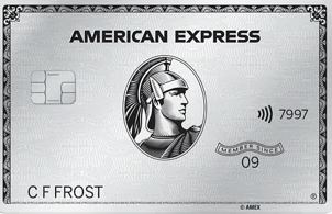
Amex Platinum
I prefer classic designs, and the Amex Platinum card manages to present one strongly while also maintaining a sleek look. I’m a fan of the updated font, which puts off a simple, streamlined card appearance. Also, I’m a sucker for the “Member Since” inclusion. I get an easy kick out of seeing that year on there. The substantial weight to the card brings more tactile satisfaction. All of this stuff easily works on me. Close relatives of this card design include the Amex Gold and Green, not to mention all of the business versions.
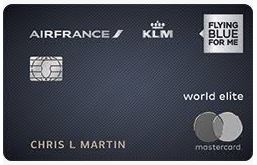
Bank of America Air France KLM World Elite Mastercard
I find the pairing of the matte blue/gray along with the silver color of the Air France, KLM, and Flying Blue logos pleasing. I enjoy the striking contrast of these two elements and the distinctive card logos. The Mastercard logo also matches the same color scheme. Even the silver card chip blends in. Everything seems to click here.
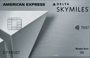
Delta SkyMiles Platinum
This one surprised me. I just started bothering with Delta credit cards a year or so ago, and I picked up the Platinum version in May. The combination of card materials, striking silver colors, Delta logo incorporation, and card weight delivers the goods. A small “Member Since” section is in the bottom right corner of the card. The understated American Express script complements the SkyMiles branding of the card. It’s too bad the spend categories aren’t attractive enough for me to carry this one around often.
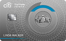
Citi Premier (Previous Design)
Since I like throwbacks (hell, I enjoy the Miller Lite design), it’s probably no surprise that I like the Citi Premier look. To be clear, I like the previous design of the Citi Premier displayed above. If anything, I feel like the picture in the middle should have be more prominently displayed on the card. Instead, Citi went the other way with their latest design. You know, the one that looks like something out of an Apple store.
Worst Looking Cards

Chase Sapphire Reserve
Okay, I may lose some of you here. From my perspective, Chase’s flagship card tries to be like Amex’s, but comes up short in most all areas. The shiny black, dark, and blueish colors don’t mean much with the substandard card design. What exactly are all those lines in the top right corner? They just look like a bunch of pick-up-sticks to me. The Sapphire Reserve logo in the top left corner is fine, but nothing jaw-dropping.
Probably one of the worst design flaws in recent memory, though, is the lettering of this card. Due to the mediocre materials used on this card and the etching, anyone with an A, B, D, O, P, Q, or R in his or her name is probably disppointed. Why? Because the card material filling those letters comes off rather easily. The card just looks cheap at that point. Chase attempted to weight this card to differentiate from their other cards. In my view, though, the weight difference is inadequate and too similar to their lower-end cards. Meh.
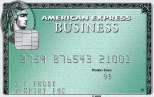
Amex Business Green
The classic look gone awry! This card’s Amex logo seems misplaced in the top left corner. Also, the “American Express Business” script is in two different fonts and sizes! That’s a big no-no, from my perspective. And many of us are stuck with this design a lot. How? Because in addition to the regular Amex Business Green card, this same design is used on the authorized user Green version for the Business Platinum card, among others.
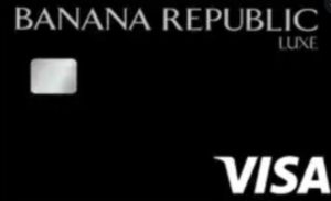
Banana Republic Luxe Visa
Luxe has historically been the elite status of the Banana Republic program and card, so Synchrony probably wanted to make it look higher end. So, what did they do? Other than the white Visa logo, they made the rest of the card black – including all card info! It’s hard to read anything on this card. I shouldn’t have to turn on a spotlight just to make out the card number. It looks pretty much like the infamous This Is Spinal Tap album. This is perhaps the real life version of those band members signing that black album with a black Sharpie. A whole lot of nothing.
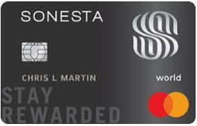
Bank of America Sonesta World Mastercard
In my view, this card has two major negatives. First, it has a terrible Sonesta logo – I almost get dizzy looking at it. Indeed, Ian has referred to this as the “SSSS of credit cards.” Second, a company slogan, “Stay Rewarded”, is plastered on the card, and it’s huge. The whole card is garish.

Amtrak Platinum Mastercard
The bones I have to pick with this card are relatively minor but glare at me every time I pick mine up. The white Amtrak logo does not contrast enough with the light gray background. Remember going to Blockbuster Video and looking in the window, only to see a bunch of faded, dusty VHS cases that you couldn’t make out? That’s what this card reminds me of. Also, my name is in silver on the light gray backing. Okay, not bad. But my name extends over a similar, shiny silver background on the right side of the card. At first glance, it looks like my name is incomplete on the card. Not a huge deal, but it’s annoying, nonetheless.
More Hot Opinions on Credit Card Designs
- I like the symmetry of the Citi card designs, including the consistent looks of the Prestige, Premier, Rewards+, Double Cash, and Custom Cash.
- An ultra premium card should not be purple. The Delta SkyMiles Reserve Amex cards are the primary culprits here.
- Discover’s default designs are boring, but you can request a new card with a customized design once you’re a cardholder. A nice touch!
- The Hilton Honors Amex Aspire card design needs an overhaul. Particularly, I think the card needs a more elegant look and weight to it.
- This isn’t a card design flaw, but Amex needs to stop issuing different cards with the same last 4 (and sometimes, 5) digits by default.
- The Rakuten Visa’s purple card with yellow piping is probably the easiest card which I quickly identify.
- I’m enjoying the Amex Rose Gold as another easy option for distinguishing it from other “regular” Gold accounts.
- The clear Amex card designs (including Everyday, Everyday Preferred, Blue Business Plus) are getting tiresome. These cards look old and dusty, even when they’re clean. Hopefully, Amex phases these designs out more.
Credit Card Designs – Conclusion
I certainly haven’t named all of the best and worst looking card designs out there, past or present. Big picture, card designs are of little meaning to most of us in the hobby, but we can’t help but notice when something looks great (or not). Still, I shake my head at how credit card designs work on me. If and/or when I get around to closing my last Amex Platinum, I’ll definitely miss the card itself.
What are the best and worst looking cards out there to you?

Newly designed Banana “Icon” showed up today. It’s almost as though Synchrony saw this article and said “hold my beer…”
Randy,
I’d like to think I have that much sway! Only in my own mind.
The original Citi Prestige design was absolutely terrible. The number of times I had a server come back saying “your card was declined” or “your card isn’t working” was crazy! Plus the printed design on it wore off so easily. Ridiculous for a premium card!
Andrew P,
That’s right – the mag stripe on the front! Citi seemed to acknowledge that mistake rather quickly, from what I remember…
Blue Business Plus got a new design a few months ago.
Brutus,
That’s right – hence the “more” in my statement above. Plenty of us still haven’t received cards with the new design. Hopefully, Amex will send out replacements to more cardholders soon.